
Your character is a pirate in search of FABULOUS TREASURE!


Now that you’ve been through the entire comics-making process from start to finish, it’s time to share it with the world! To do that, you may need…

When you pick up a comic (or a DVD, game, etc), the first thing you see is its cover. The cover can tell you what the comic is called, who made it, and what the story is about, but most importantly – it can help you decide if you want to read it!
Look at the comics below, and think about these questions:
What do you think these comics are about?
What stands out to you about their designs?
Do the covers make you want to read them?

One thing you might have noticed is that the above comics all have completely different logos! You can have a lot of fun in designing your own logo. Let’s look at little more closely at Vera Brosgol’s Be Prepared:
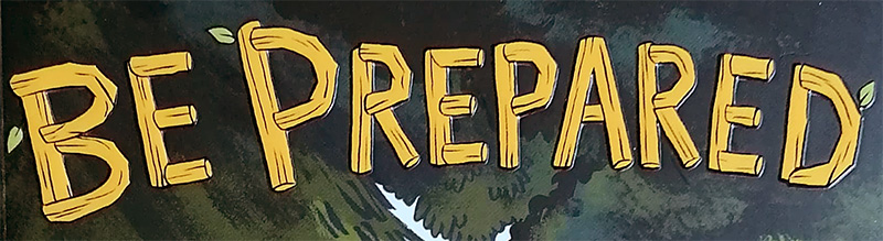
Now wait a minute – those words are made of wood! Be Prepared is set at a summer camp in the forest, so the artist has designed the logo to fit the setting. You don’t have to do this with your logo, but it is a super cool thing that you could do!
Logos can be designed by the person who drew the comic, by the letterer, or sometimes by a dedicated person who only designs the logo. It depends on the comic! If you find that you really like designing logos, you could offer to do them for your friends!

It can be hard to think of ideas when you’re looking at a blank sheet of paper, so break it down into smaller steps! What do you want people to see? You might want to show off your characters, the setting, a dramatic moment from your story, or a mixture of these. Drawing thumbnails can help you try out different ideas!
How big do you want the title to be? Where do you want to put your characters? Where is your name going to go? Drawing a grid on your paper first (in pencil, because you want to be able to erase it later!) can help you break up the page and plan out where to put everything:

Whatever you choose to do, a great cover will make people want to read your comics. Just remember to put your name on it!!
You’ve written a story for your comic (and maybe turned it into a script), you’ve pencilled and inked it, and maybe you’ve coloured it too! You’re on a roll! What else might you need?
Words in boxes, balloons, bubbles, and other shapes! We covered this briefly way back in Week 1, but here’s a reminder of the types of balloons that we see the most often:

Like every other part of comics, lettering has endless possibilities. Some people letter by hand, others letter digitally (you can even design your own fonts), and it can look totally different depending on the comic! Have a look at the comics around you – what does the lettering look like?
Lettering can be tricky! Is there enough room for words in your panels? How big should your balloons be? Are two people talking in the same panel?! AHH! Here are some tips to make it easier:

Part of the fun of sound effects is making them look like the sound that they’re making! Think about what you ‘hear’ in your head as you imagine different sounds – what’s loud? What’s quiet? What else can you draw to make it really have an impact? Have a go at drawing your own sounds with the sheet below:

We’ve gone through the steps on our own comic over the past few weeks, and now you can see them all together!

Before we colour our comics, let’s start with some basics.

The colour wheel helps us to see the relationship between different colours. Labelled above are the primary colours (red, blue, and yellow), secondary colours (green, orange, and purple) and tertiary colours (where all the subtle names for colours come in!).
In painting, when you mix equal amounts of two primary colours, you get a secondary colour. Red with blue makes purple, red with yellow makes orange, and yellow with blue makes green.
However! When you mix smaller amounts of either of your primary colours, you’ll get tertiary colours. For example, mixing blue with a little bit of yellow will make teal.
But that’s not all! Adding black to a colour will make it a darker shade, while adding white will make it a lighter shade. There’s a lot to think about when you’re mixing colours!
Not everyone will want to colour their comics using paint, but understanding how colours relate to each other can help you with the next step:
There are lots of ways to choose colour schemes using the colour wheel, but here are two simple ones:
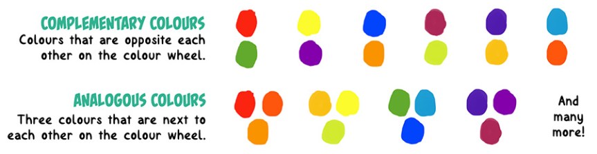
Complementary colours contrast each other because their opposite colour isn’t related. Green is made up of yellow and blue, so it stands out against red. Orange is made up of red and yellow, so stands out against blue!
Analogous colours go well together because they are related, and are made up of the same primary colours. This creates a harmonious colour palette which is pleasing to look at.
If you’d like some inspiration, you can find colour palette generators online, and the possibilities for colour schemes are endless!
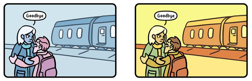
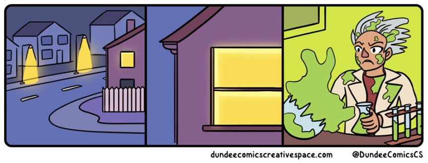
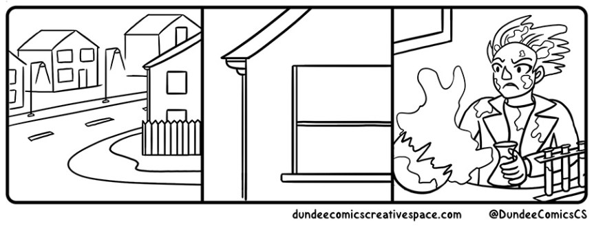
Colours can tell us how a character is feeling, where the story is set, what time of day it is, the weather, and so on! All of these things can change the mood of your comic. See how the panel below ‘feels’ different depending on how it’s coloured?
Think about what colours you associate with certain emotions and places. What colour (or colours) would you use to show a character is really happy? What about if they’re feeling sick? How would you colour a beach during summer time, or a garden during winter?
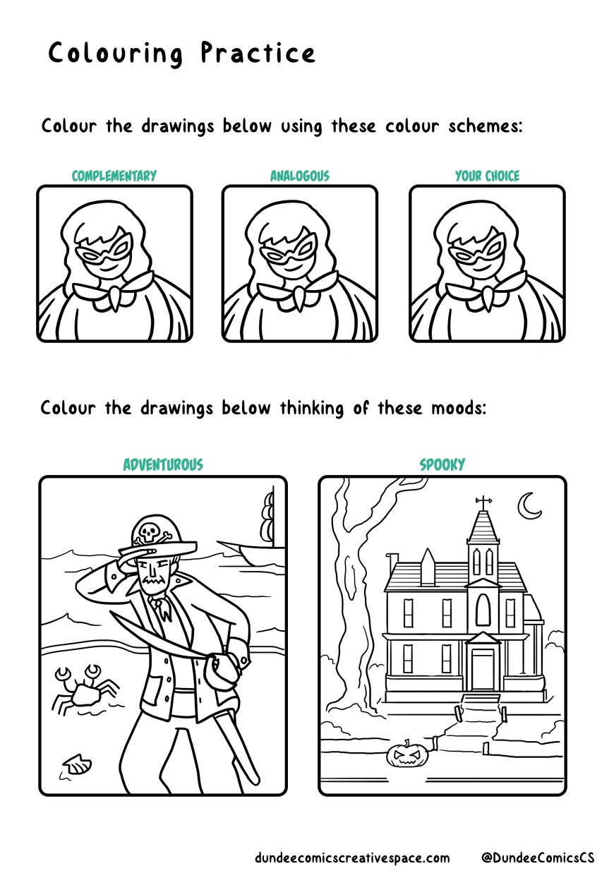
With all of your new colouring knowledge, practice using different colour schemes with the sheet below!
Now in glorious technicolour!
What comes after pencilling? Inking, of course!* There are lots of tools that you can ink with, and they each have different uses.

Want to draw lots of little intricate details? A fineliner or dip pen are great for that.
Want to cover a large area of black without it taking an eternity? Use a big brush with ink or a broad felt tip/marker.
Different tools will produce different thicknesses of line (or line weights), and your inker of choice will affect your finished drawing.
See how the drawings below look different?

The first one has the same line thickness for everything, while the second one has a thinner line for one of the characters. What does this do? It shows us that one character is in the background!
You can create this effect simply by using a thinner pen, but some tools will allow you to draw thin and thick lines. For example, take a brush pen – if you press lightly, you’ll get a thinner line. If you press hard, you’ll get a thicker line. Simple! This also applies to digital pen users.
Another thing to think about when inking is how much detail you put into your drawing. If you put lots of details into a specific area, that’s where your reader is going to look first. What do you want people to look at? What’s most important in telling your story?
Here are some drawings for you to practice inking with! Think about how thick and thin you’re making your lines, and where you might want to fill in areas of black. Most importantly, have fun with it, and stay tuned for colouring next week!

*Not always, but that’s something we’ll go into later!

You’ve worked out your story and made it into a script, so now you can start pencilling your comics! This can go through two stages:
 Thumbnails
Thumbnails are small, rough drawings that help you work out how to fit everything from the script onto the pages. They don’t have to make sense to anyone but yourself!
 Pencils
Pencils are – you guessed it – the pencil drawings of your comic page! Using your thumbnails as a guide, you draw the page larger and with more detail (how much detail you add is up to you!).
Remember our script from last week? We’ll be using that comic to show you each of the stages – pencilling, inking, colouring, and lettering – over the next few weeks. Are the pencils below anything like what you imagined when you were reading the script?

As you go through the stages of making your own comics, you’ll find out what you’re most comfortable doing. Also, with any stage of drawing, you can change your mind about how you want it to look! Maybe a panel looked really good as a thumbnail, but now looks strange at full-size? Don’t be afraid to change it.
Each of our Thursday prompts starts life as a digital pencil sketch! Have a look at how they go from sketch to finished drawings below (and see what changes along the way!).
